


What are media queries?
Responsive Design is the practice of making sure your content looks good on all screen sizes. Everything in the website including layouts, fonts and images should automatically adapt to the user's device.
Media queries can modify the appearance (and even behaviour) or a website or app based on a matched set of conditions about the user’s device, browser or system settings.
The CSS Media Query gives you a way to apply CSS only when the browser and device environment matches a rule that you specify.Media queries are a key part of responsive web design, as they allow you to create different layouts depending on the size of the viewport.
Understanding the syntax
@media media-type and (media-feature-rule) {
  /* CSS rules go here */
}
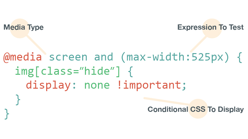
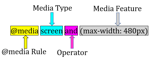
- @media - tells the type of media that a site is viewed with, what features that media type supports, and operators that can be combined to mix and match simple and complex conditions alike.
Media Type - tells the browser what kind of media this code is for (e.g. print,or screen).
Operator - Media queries support logical operators like many programming languages so that we can match media types based on certain conditions.
and
/* Matches screen between 320px AND 768px */
@media screen (min-width: 320px) and (max-width: 768px) {
  .element {
    /* Styles! */
  }
}
or (or comma-separated)
/*
  Matches screens where either the user prefers dark mode or the screen is at least 1200px wide */
@media screen (prefers-color-scheme: dark), (min-width 1200px) {
  .element {
    /* Styles! */
  }
}
not
@media print and ( not(color) ) {
  body {
    background-color: none;
  }
}
- media Feature/expression - A media expression, which is a rule, or test that must be passed for the contained CSS to be applied.
Live preview of a website


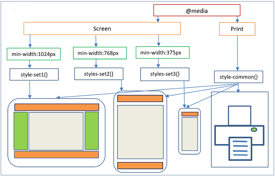
Breakpoints for Devices
CSS breakpoints are the points added in the code, the website content responds to these points depending on the device screen size. This helps in displaying an ideal layout to the end-user. CSS breakpoints are used along with media query due to which it is also known as CSS media query breakpoints.
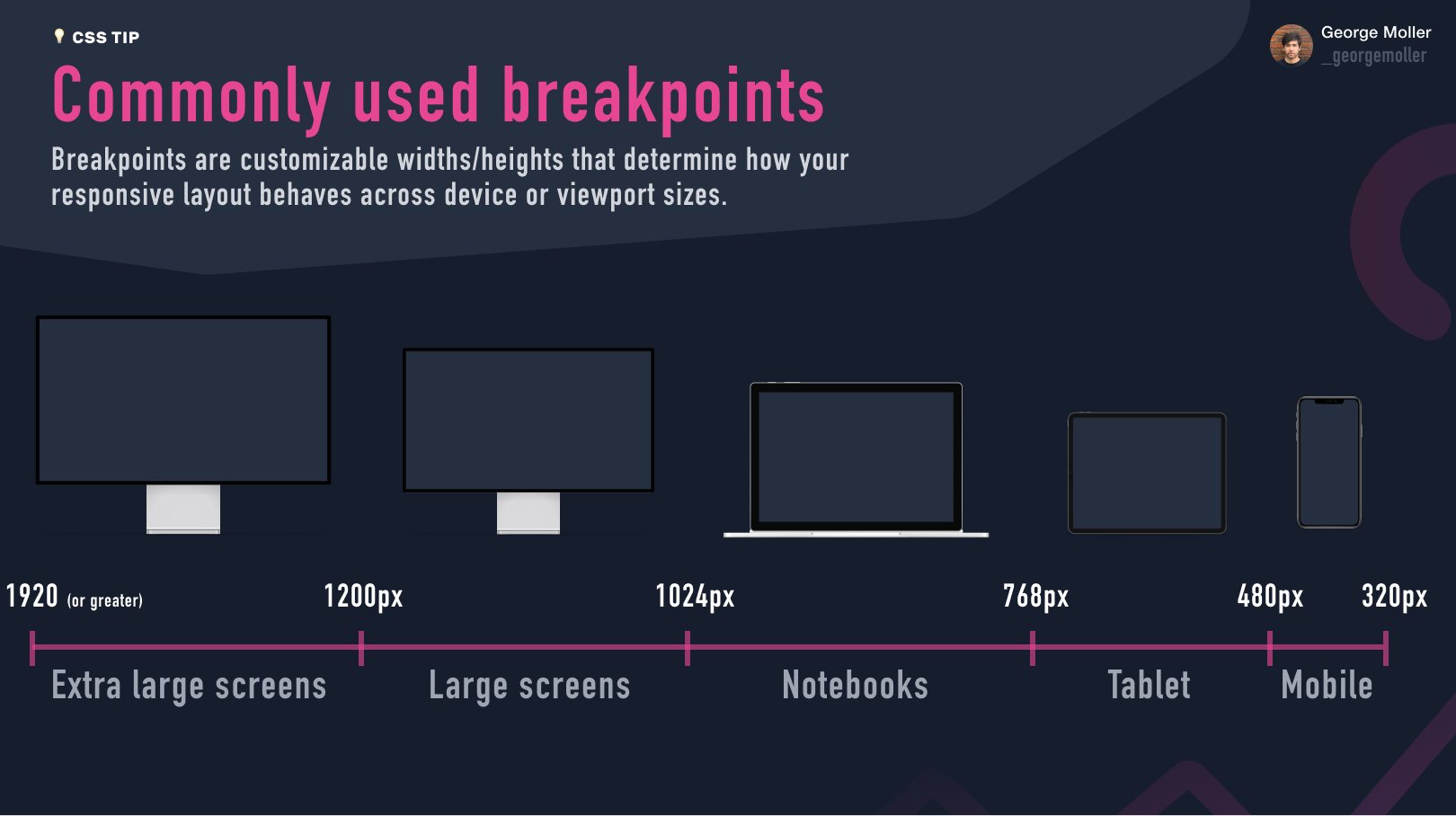

Read - How to use CSS breakpoints to create responsive designs
Min-Max width
The feature we tend to detect most often in order to create responsive designs (and that has widespread browser support) is viewport width, and we can apply CSS if the viewport is above or below a certain width — or an exact width — using the min-width, max-width, and width media features.
@media only screen and (min-width: 600px)
 {...}
What this query really means, is “If [device width] is greater than or equal to 600px, then do {…}”
So if the email is opened on an iPhone 5S with a screen width of 320px, the media query will not trigger and the styles contained in { … } will not take effect.
@media only screen and (max-width: 600px)
{...}
What this query really means, is “If [device width] is less than or equal to 600px, then do {…}”
So if the email is opened on an iPhone 5S with a screen width of 320px, the media query will trigger and all of the styles contained in { … } will take effect.
Essential media features
width and height
These two are very commonly used media features and are an essential part of responsive web.
/* Exact width */
@media (width: 360px) {
  body {
    ...
  }
}

/* Maximum width */
@media (max-width: 768px) {
  body {
   ...
}

/* Minimum width */
@media (min-width: 992px) {
  body {
    ...
  }
}

/* Exact height */
@media (height: 360px) {
  body {
    ...
  }
}

/* Minimum height */
@media (min-height: 640px) {
  body {
    ...
  }
}

/* Maximum height */
@media (max-height: 768px) {
  body {
    ...
  }
}

/* All the values can also be in rem, em, vw, vh */
Orientation There are two orientation values-
portrait: The viewport is in a portrait orientation, i.e., the height is greater than or equal to the width.
landscape: The viewport is in a landscape orientation, i.e., the width is greater than the height.
@media (orientation: landscape) {
    /* landscape styles */
}

@media (orientation: portrait) {
    /* portrait styles */
}
This media feature helps in responsive design. We can use it with other media features such as width and height.
@media screen and (min-height: 640px) and (orientation: portrait) {
    ...
}
display-mode
Applies styles based on the display mode of an application. Available modes are: fullscreen, standalone, minimal-ui and browser.
@media all and (display-mode: fullscreen) {
  body {
    margin: 0;
    border: 5px solid black;
  }
}
Wrapping Up
Now you have a good understanding of what media queries are, why they are useful, and how you can use them to make your website more appealing to visitors on mobile devices. Also, CSS media queries are not the be-all-end-all of making your site responsive. There are also other ways to have your design adapt, such as the aforementioned flexbox and grid.
I hope you've learned at least a couple of things in this article, thank you for reading till the end! For daily web development threads, updates and content follow me on Twitter. Happy Coding🌼